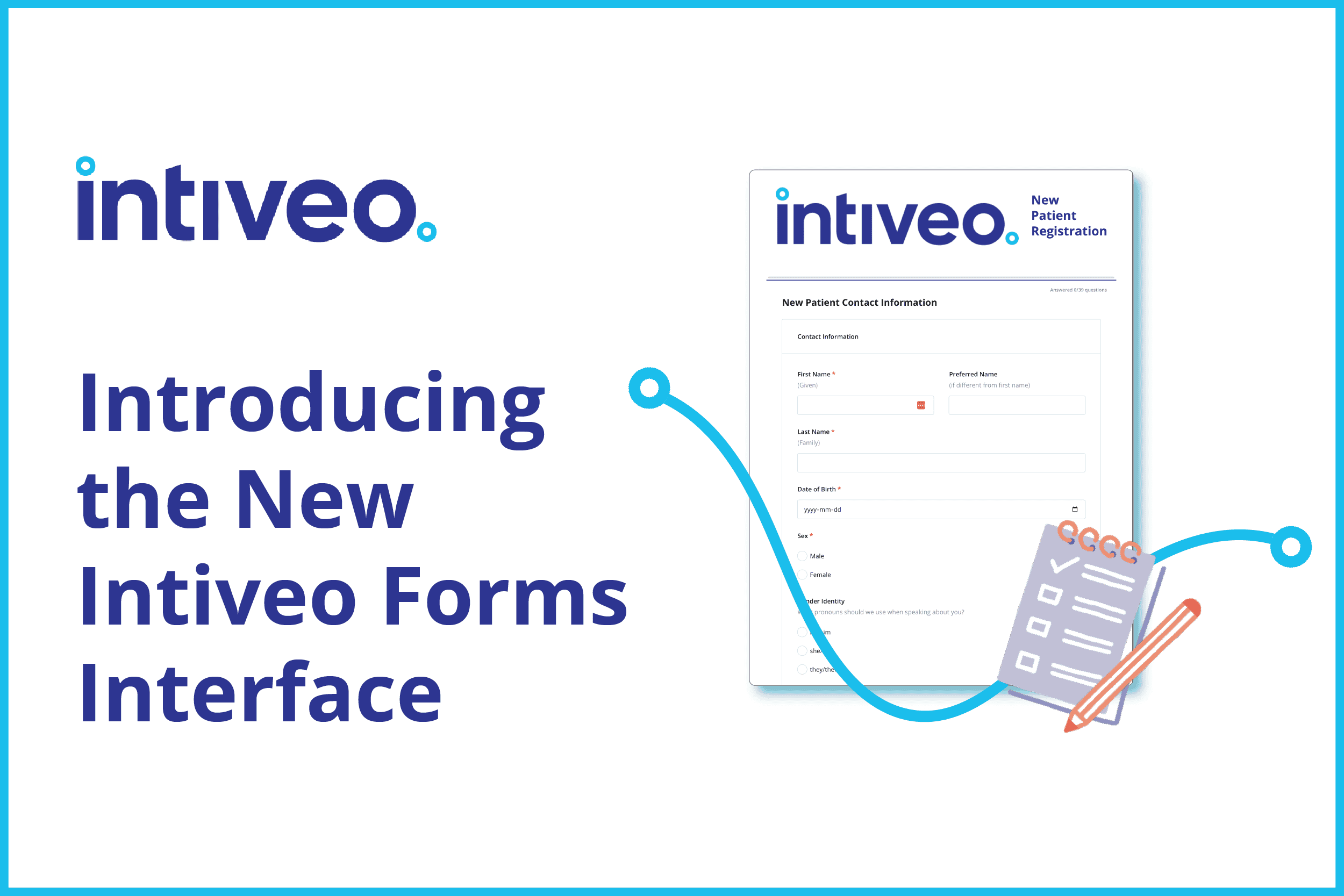
At Intiveo, we are always striving to create the best experience possible for the dental and oral surgery practices we serve. That’s why we’re thrilled to introduce the latest innovations in Intiveo Forms! Designed with the needs of dental and oral surgery practices in mind, we’ve made changes to our interface to streamline your workflow and enhance patient experience.
Let’s take a closer look at what’s new in Intiveo Forms!
Creating Forms Just Got More Intuitive
With the introduction of the new interface, you can say goodbye to clutter. Our updated forms offer more breathing room, making it easier for you to select exactly what you need without feeling cramped. Some of our changes include:
- Collapsible menus to provide more workspace – especially when you’re working on a small monitor!
- Improved paged navigation to make multi-page forms easy and save on time switching between pages
- New drawer headers that allow you to organize your components that much better, making for a more intuitive form-building experience
Overall, things just happen more quickly with the new Intiveo Forms interface! You can save time with a fast entry option, allowing you to copy and paste multiple lines of questions to quickly create lists of checkboxes, “pick one” options, and more. Plus, spend less time waiting for things to load. These performance enhancements mean you can get in, make your changes, and move on with your day faster than ever.
Making Forms Easy for Your Patients
The new interface supports you in enhancing your patients’ experience of Intiveo Forms. With new logic options, your patients can pre-fill fields based on earlier answers, saving them time and reducing the likelihood of errors. Before you send your forms, you’re also able to check their responsiveness, previewing how they will look on phones, tablets, and desktops, facilitating a seamless patient experience. And, with faster versioning, you can make changes and see how they will look for patients easily without entering fake data to bypass required fields. With components stacking horizontally, you can better visualize how the form will look for your patients.
In addition, a language barrier never needs to be an insurmountable barrier! Our new translation interface allows you to easily add or edit translations for each question, in multiple languages.
Plus, you can give your patients a cohesive experience of your practice by tailoring the style of your forms to stay consistent with your practice’s brand!
Why These Improvements Matter
At Intiveo, we understand that your time is valuable. This new interface is designed to help you work more efficiently, reduce errors, and provide a better experience for your patients. Whether you’re updating patient intake forms, creating new consent forms, or streamlining your office workflows, our improved Forms Add-ON is here to support you every step of the way.
Ready to Experience the Intiveo Forms Difference?
Don’t just take our word for it—experience the difference for yourself. Start leveraging these new features today and see how much easier managing your dental forms can be.
By consistently refining our tools and features, we strive to provide dental professionals like you with the best possible resources to excel in your practice. Thank you for choosing Intiveo as your trusted partner in dental care management.
Let’s chat Intiveo Forms!


